A Call to action is recommended if you want to interact with your user. Divi provides a Call to Action through Toggle and accordion Modules. It normally has a Subtitle and Title. However, the Divi Toggle and Accordion modules don’t let you do so. In addition to being a wonderful method to attract users to open the toggle, adding a second line of text often gives more context or details about the toggle’s contents.
In this article, I will show “How to add Subtitle in the second line of Toggle & Accordion Modules in Divi”:
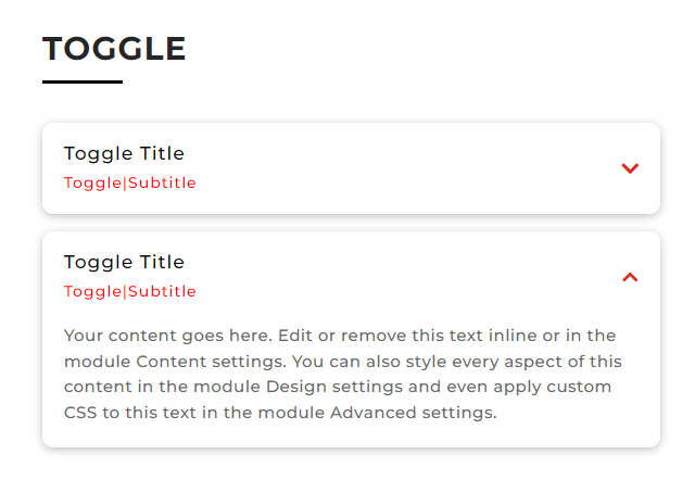
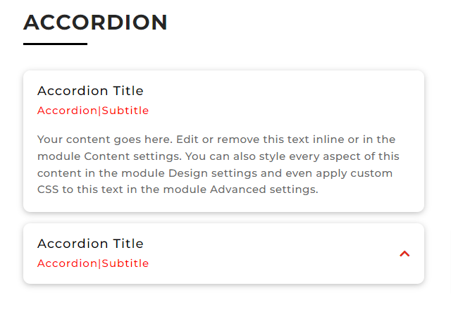
Results:
For the Toggle Module:
For the Accordion Module:
Customizing the Toggle Module1:
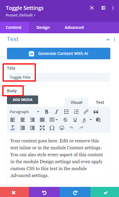
After adding a Toggle Module go to the Toggle Settings > Content > Title, Body, and add a title and Body Text:
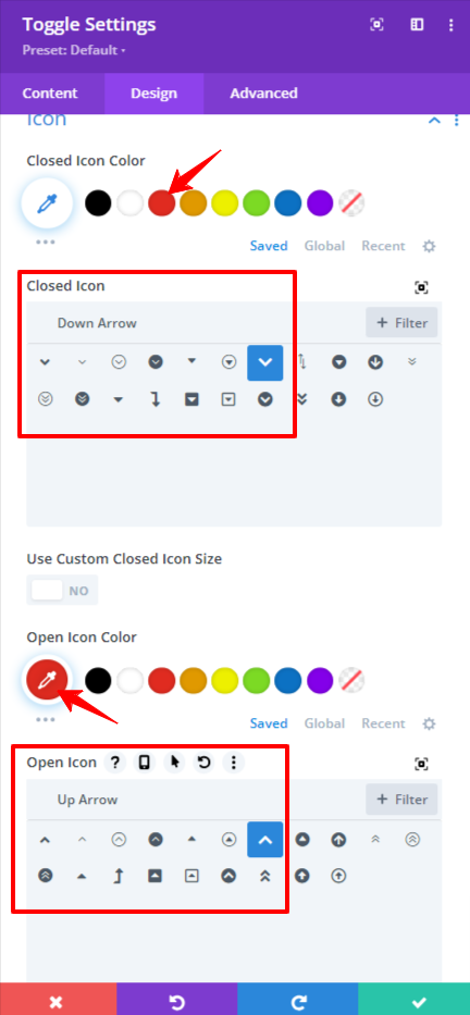
Then go to Toggle Settings > Design > Icon and do the following customizations:
- Closed Icon Color: #e02b20
- Closed Icon: Down Arrow
- Open Icon Color: #e02b20
- Open Icon: Up Arrow
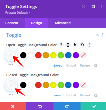
Go to Toggle Settings > Toggle and add these colors there:
- Open Toggle Background Color: #ffffff
- Closed Toggle Background Color: #ffffff
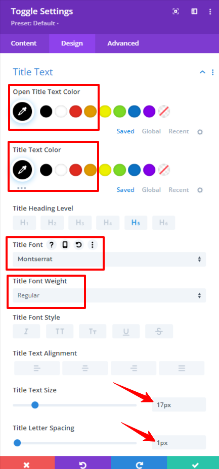
Now go to Toggle Settings > Design > Title Text and do the following customizations:
- Open Title Text: #00000
- Title Text Color: #oooooo
- Title Font: Montserrat
- Title Font Weight: Regular
- Title Text Size: 17px
- Title Letter Spacing: 1px
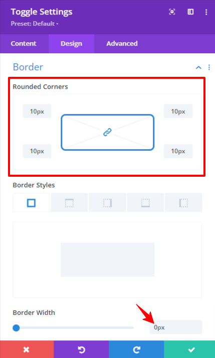
Go to Toggle Settings > Design > Border and remove the borders like this:
- Rounded Corners: 10px
- Border Width: 0px
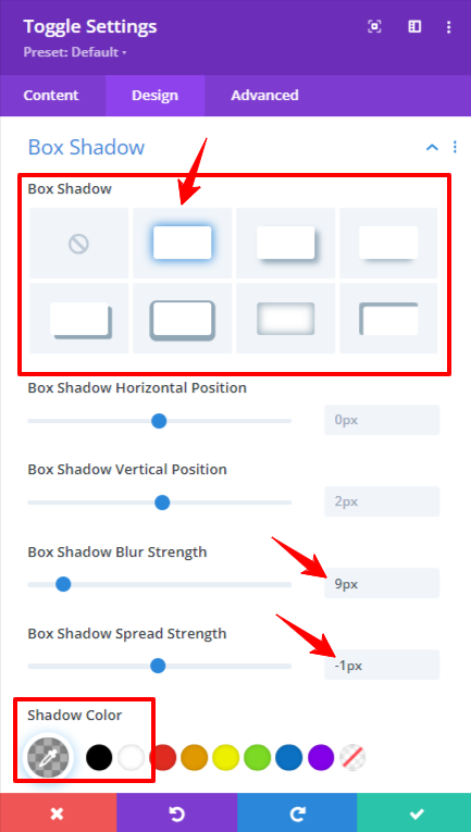
Go to Toggle Settings > Design > Box Shadow and add the Box Shadow:
- Box shadow Blur Strength: 9px
- Box Shadow Spread Strength: -1px
- Shadow Color: rgba(0,0,0,0.3)
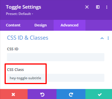
In toggle settings go to Advanced > CSS ID & Classes and add the following class there:
hey-toggle-subtitle
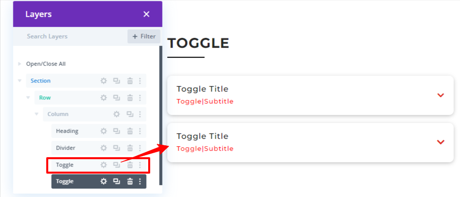
Customizing Toggle Module 2:
Duplicate the Toggle module 1 by going into Layers.
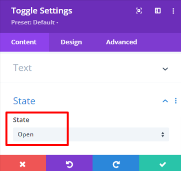
After Duplicating the Toggle Module. Go to Duplicated Toggle Module Settings > Content > State and set the state to “Open”.
Adding and Customizing Accordion Module:
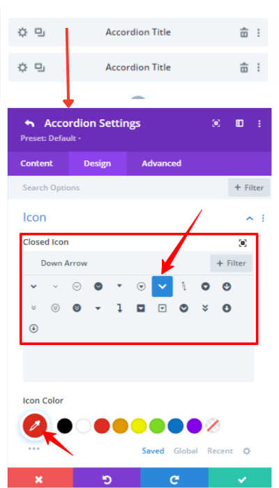
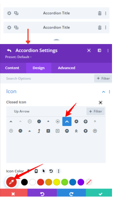
Add an Accordion Module and then go to the Settings of the First Accordion item > Design > Icon and do the following settings:
- Closed Icon: Down Arrow
- Icon Color: #e02b20
Then Go to the Settings of the Second Accordion Item > Design > Icon and do the following modifications:
- Closed Icon: Up Arrow
- Icon Color: #e02b20
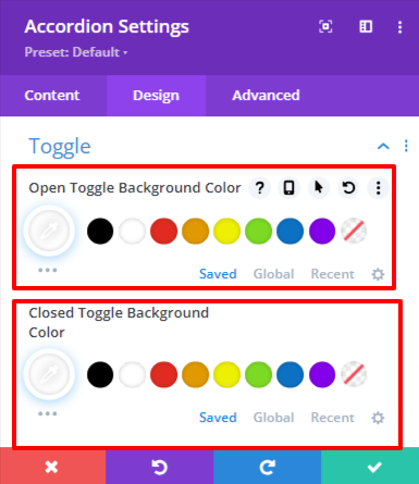
Then come to the settings of Accordion Module > Design > Toggle and add these colors there:
- Open Toggle Background Color: #ffffff
- Closed Toggle Background Color: #ffffff
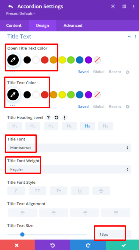
Now go to Accordion Items Settings > Design > Title Text and add these customizations in all the accordions items:
- Open Title Text: #00000
- Title Text Color: #oooooo
- Title Font: Montserrat
- Title Font Weight: Regular
- Title Text Size: 18px
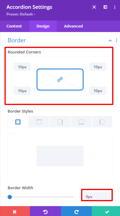
Go to the Accordion Settings > Design > Border and remove the border:
- Rounded Corners: 10px
- Border Width: 0px
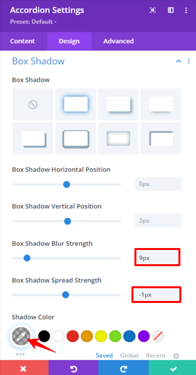
Go to the Accordion Settings > Design > Box Shadow and add these Box Shadow Customizations:
- Box shadow Blur Strength: 9px
- Box Shadow Spread Strength: -1px
- Shadow Color: rgba(0,0,0,0.3)
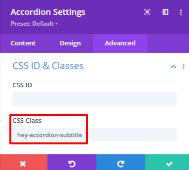
Then go to Accordion Settings > Advanced > CSS ID & Classes and add this class there:
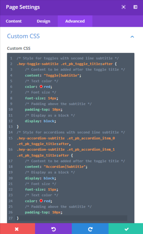
Pasting all the Custom CSS Code:
Go to the Page Settings > Advanced > Custom CSS and paste this code there:
/* Style for toggles with second line subtitle */
.hey-toggle-subtitle .et_pb_toggle_title:after {
/* Content to be added after the toggle title */
content: "Toggle|Subtitle";
/* Text color */
color: red;
/* Font size */
font-size: 14px;
/* Padding above the subtitle */
padding-top: 10px;
/* Display as a block */
display: block;
}
/* Style for accordions with second line subtitle */
.hey-accordion-subtitle .et_pb_accordion_item_0 .et_pb_toggle_title:after,
.hey-accordion-subtitle .et_pb_accordion_item_1 .et_pb_toggle_title:after {
/* Content to be added after the toggle title */
content: "Accordion|Subtitle";
/* Display as a block */
display: block;
/* Font size */
font-size: 15px;
/* Text color */
color: red;
/* Padding above the subtitle */
padding-top: 10px;
}
Results that you were looking for:
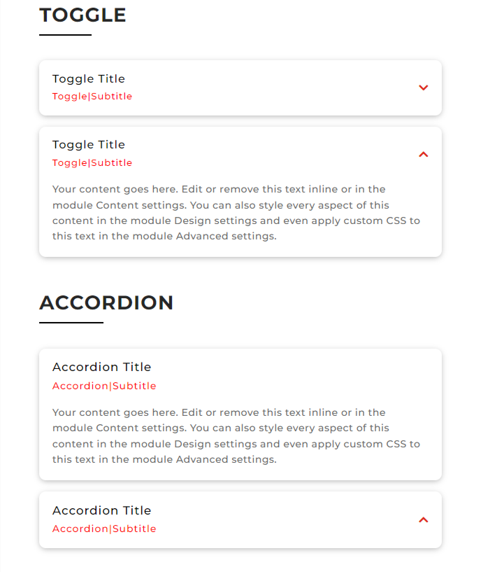
The headings in this image are not shown how to make them because they are to separate the Toggle and Accordion Module.
Conclusion:
“How to add Subtitle in the Second line of Toggle & Accordion Modules in Divi” is clarified in the above words. The Divi Accordion Module is very flexible as it can be used to show multiple accordion items with animations but the Div Toggle Module cannot. Hence the Accordion Module is recommended in some cases.